In this blog, we will give you the easy method to view the mobile version of WordPress site from desktop. If you want to level up your WordPress skill, check out right now!
How is the importance of viewing the Mobile version of your WordPress site?
More than half of your website visitors access your website using their mobile devices instead of computers, according to many surveys. This is also one of the reasons you should make sure the design of your website is responsive to all devices.
Even though most WordPress WordPress Themes nowadays are fully responsive, you should still check how it looks on mobile devices first. As well, you should develop mobile-friendly versions of your main landing pages.
Additionally, Google uses the mobile phone as a priority index in its website ranking algorithm as one of the most important factors.
How to View the Mobile Version of WordPress Site from Desktop?
Our tutorial today shows you how to easily view the mobile version of your WordPress site using two methods. Due to the wide variety of mobile screen sizes and browsers, nothing is perfect. Here is the two easiest ways to view the Mobile Version of WordPress Site from Desktop for you to do.
Using WordPress Theme Customizer
In the WordPress Theme Customizer, you can easily view the mobile version of your site.
You can customize your appearance by going to Appearance > Customize.
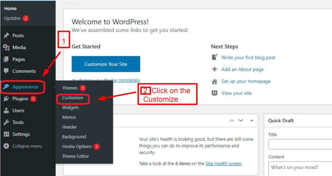
By clicking this, the theme customizer in WordPress will open. Depending on the theme you are using, you will see a list of tabs on the left-hand side of the screen. At the bottom of the screen, you’ll also see a mobile icon.
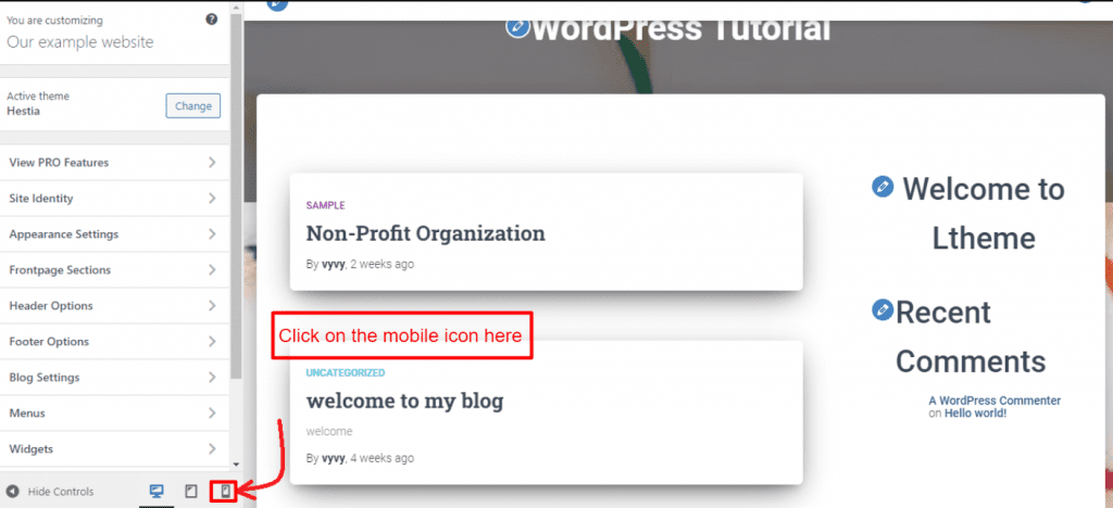
The mobile preview will show you how your WordPress website performs on a mobile device when you click on it.
When your WordPress site is not live yet, you can view its mobile version using this method. The editing symbol makes it easy for you to make changes to your website when your website is under maintenance mode or you have not yet completed your blog.
Now, you can view the mobile version of WordPress Site from desktop easily thanks to this method.
Using Google Chrome’s Dev Tools
The Google Chrome browser comes with several developer tools. By using these tools, you are able to perform many tests and checks on your website, including previewing the mobile version from your desktop.
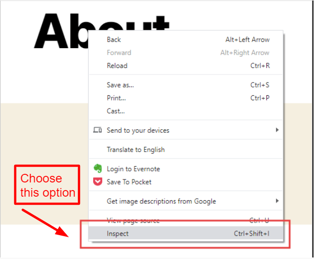
First, open your Google Chrome browser on your desktop and visit the webpage you wish to check using this method. In the options list, right-click the page and select “Inspect”.
Your site’s HTML source code will be displayed in the developer view in the new panel on the right-hand side of the screen.
The mobile version can now be switched by clicking the “Toggle Device Toolbar” option.
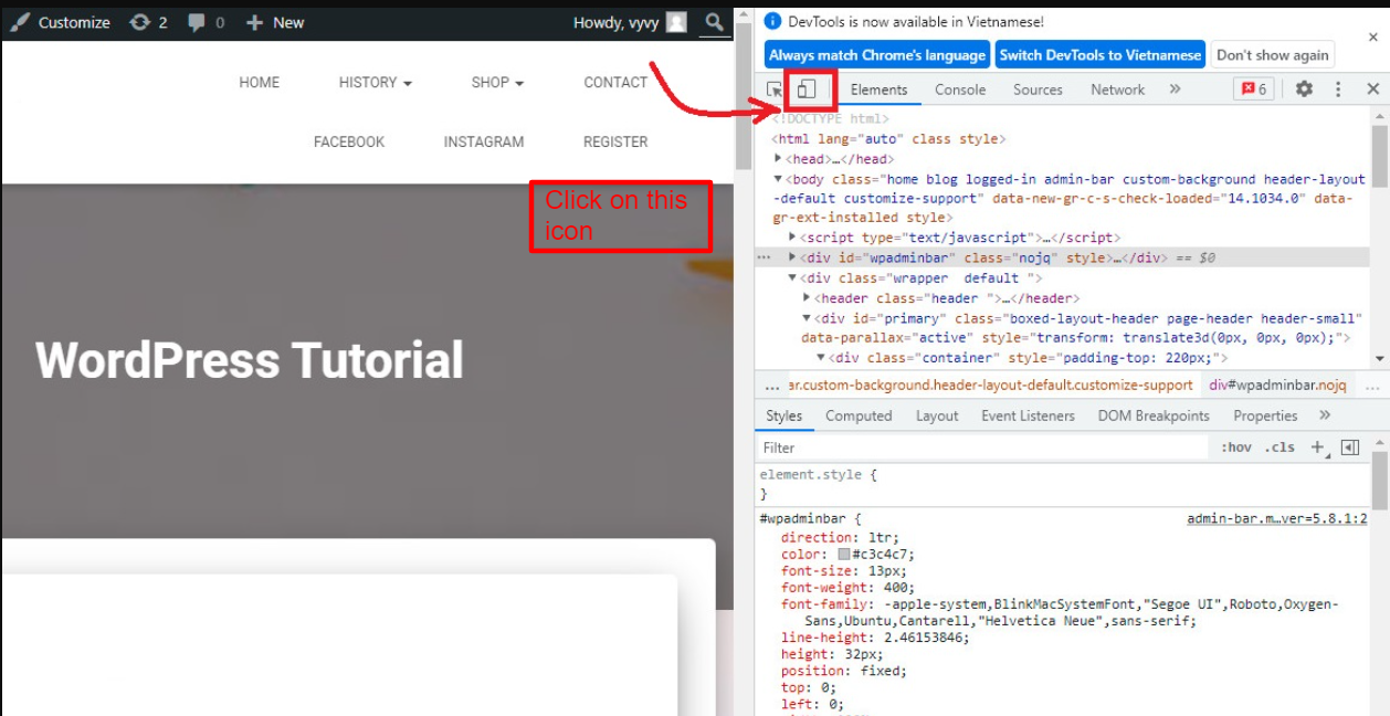
Your website will then look different on mobile devices. Your website’s menu has disappeared, for instance.
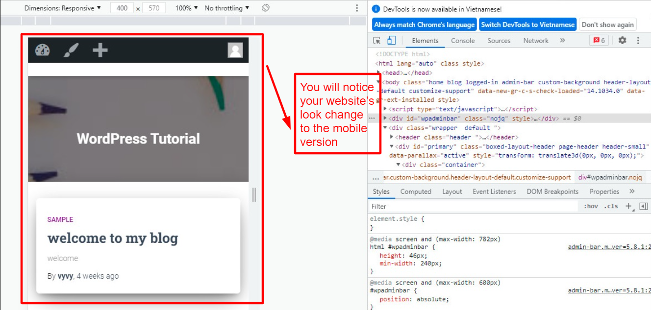
A few additional options will also appear above the mobile view. Many additional functions can be performed with these options. By clicking on the Dimensions option, you can see how your site looks on different smartphones.
Additionally, it shows how your site performs on different smartphones with percentage indicators.
Now, you can view the mobile version of WordPress Site from desktop successfully.
Sum up
Hopefully, after reading our blog, you can know clearly the way to view the mobile version of WordPress site from desktop. We will respond as soon as possible to your questions in the comments section below. Thus, feel free to do that.
Don’t forget to visit our free WordPress Themes to make your site more professional.
