5 Web Design Tricks that Will Boost Your Site’s Conversion Rate

Your website design will play an important role in whether or not someone will spend money on your business. This is because people come to your website in search of a solution to their problem but, if your design is cluttered or hard to navigate, then it can cause potential customers to leave, thus making you lose potential leads.
In this article, we’ll go over 5 tricks you can use to create an effective web design that will increase conversions on your site. Read on to find out more.
Use imagery that humanizes your business
If people can put faces to your business, they’ll feel far more connected to it and will be more likely to make a purchase. Your imagery can really help with this, so it’s a good idea to focus on using the right photos that can help you humanize your business.
You can include images of your employees on your website to help potential customers connect with the people who are behind the brand. And it’s a good idea to use images that show your staff smiling so people will feel welcome.
Another way to humanize your business with images is by displaying customer reviews with headshots. These can help to paint your business as a trustworthy brand that has real customers and, when potential clients see this, they’ll be motivated to convert.
Let’s have a look at two companies that use imagery to humanize their businesses and boost conversions so you can take some inspiration from them.
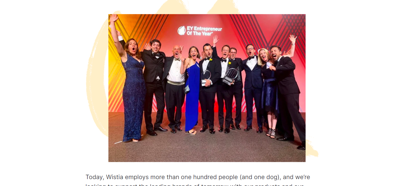
Wistia is a video hosting platform for marketers and businesses. And, on their company page, there is a photo that shows employees of the company at an awards ceremony. From the image alone, people can see the quirky and funny personalities that their team possesses and it shows prospective customers that the people behind the brand are humans who like to have fun as well.
Images like this are great for helping customers put a face to a brand and, if prospects feel they can relate to the people they see, it can also help to increase the number of conversions for the business.
One lesson you can learn from this example is not to shy away from using images that show your employees having fun or just being normal people. And, try to make sure that these images stand out so they can’t be missed. JustFreeWPThemes has plenty of featured image website themes that are ideal for this.
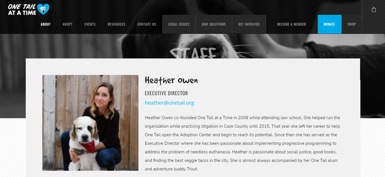
Our second example is from One Tail at a Time, a company that rescues dogs and helps them find new homes. On their staff page, they introduce each of the employees that work with the company and they do this with an accompanying picture. The first picture is that of the executive director and she is seen posing with a very cute dog.
This gives prospective customers a good impression right away, as it shows that the employees care very much about the pets they are taking care of. Also, this humanizes their brand and makes people feel very comfortable about getting pets from the company, which will increase their conversion rate.
You can emulate them by using happy pictures of your employees on your website. And, even if you don’t own a dog shelter, you could encourage your staff to take photos with their pets as this will make your brand seem more relatable and friendly to prospective customers.
Ensure your calls-to-action really stand out
A call-to-action (CTA) is a prompt that gives your website visitors a clear instruction of what to do next. A good CTA can boost conversions because, even though people might know what they want to do, sometimes you still need to guide them toward taking the desired action.
To ensure that your CTAs really stand out, you should consider designing them in bright colors that contrast against the background of your website. For instance, if the color of your website homepage is white, consider using a red CTA button that will really draw attention. You should also consider placing your main CTA at the top of your website pages because this will be more noticeable for visitors who land on your page.
There are so many ways to make a CTA stand out, and it might not be immediately clear what kind of approach is going to work best for your website visitors. So, you might want to consider A/B testing some different CTA designs. A/B testing is when you create two versions of a webpage to see how your audience responds to them and this can be very beneficial if you want to get a real idea of what style of call-to-action will give you the best results.
Two good examples of businesses that have great CTAs are Evernote and Dropbox. Let’s take a look to see what ideas you can get and replicate for your brand.
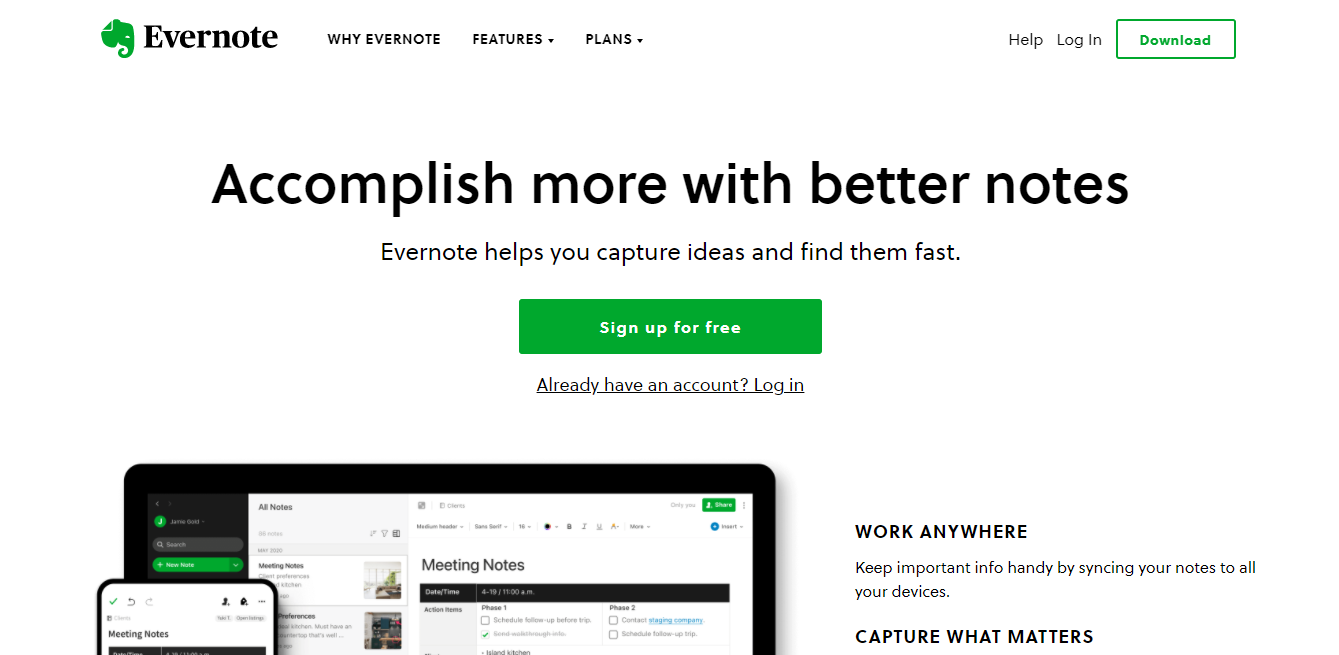
Evernote is a note-taking app that works as an online journal to help people write down important information. With Evernote, people can capture their thoughts and ideas anytime and anywhere.
The company’s homepage features a large green CTA that says “Sign up for free”. This is displayed in a green button that contrasts well against the white background, so visitors have no choice but to be attracted to it. The words also tell people to sign up for free, which can attract those who are not yet ready to make a financial commitment. It could encourage people to jump into the top of the sales funnel and sign up to their mailing list, so the company can keep in contact with them until they are ready to make a purchase.
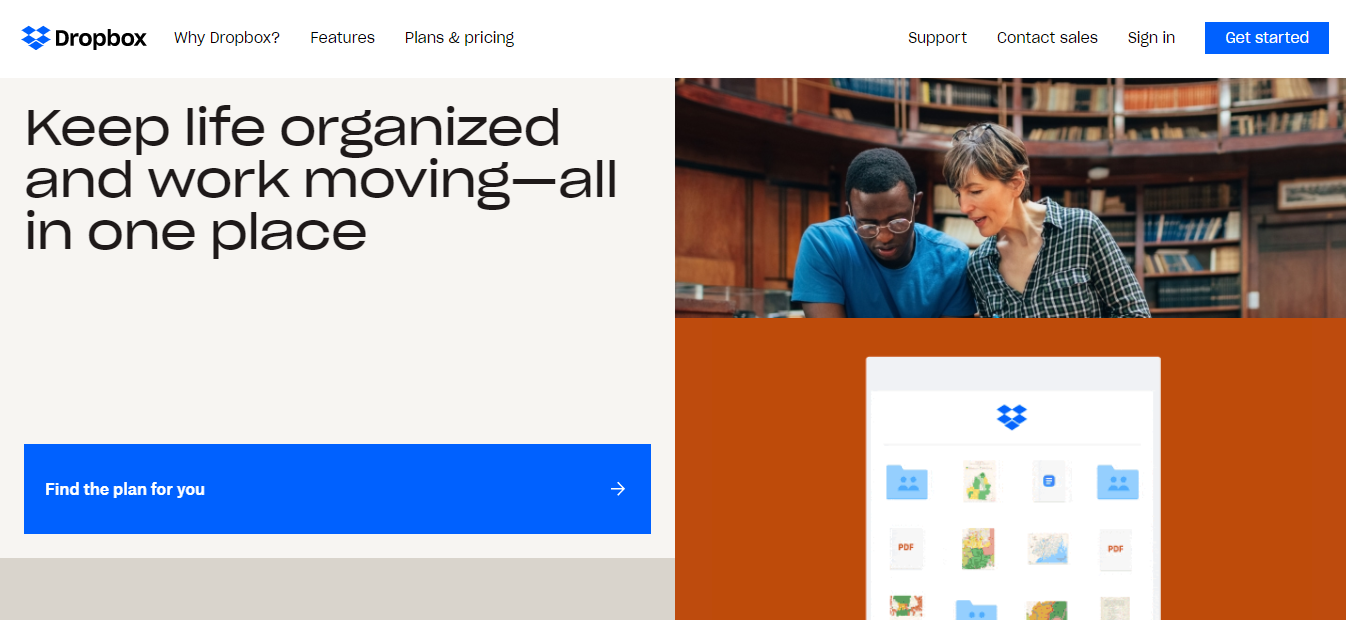
Next up, Dropbox is an online storage platform that allows people to save, share, and access files from any device.
On their homepage, you will actually find two CTAs that have been designed to catch the eyes of new website visitors. Both are displayed in blue buttons and placed strategically in the top-right corner and middle of the webpage.
Both CTAs tell visitors exactly what they need to do, whether that’s to get started or find the plan that’s right for them. The instructions are straight to the point, so there is no confusion and this can help the company get more qualified leads who are ready to use the company’s product.
You can follow this example by creating bold but simple CTAs that tell website visitors exactly what you want them to do next. You should also try placing your calls-to-action in various locations on your web pages so, whether someone’s just landed on your site or they’re scrolling down the page, it’s as easy as possible for them to take the next steps.
Include reviews or testimonials on your service pages
A good way to make visitors feel confident about using your products or services is by including reviews or testimonials on your website. Customer reviews are very effective at boosting conversions because they show prospective clients that others have had a great time buying from or working with you.
To collect reviews, you can always create a survey and send it to customers in your database. Another effective tactic is to create a GMB listing so people have the opportunity to leave you Google reviews. You can also collect testimonials from customers who leave you comments on social media.
Once you’ve collected your customers’ reviews you’ll have to consider how you’re going to display them on your site. You have a number of options, and some will work better than others depending on the type of business you have.
Let’s take a look at an example of a business that does a great job of showing off their online views, so you can get some inspiration for your own web design.
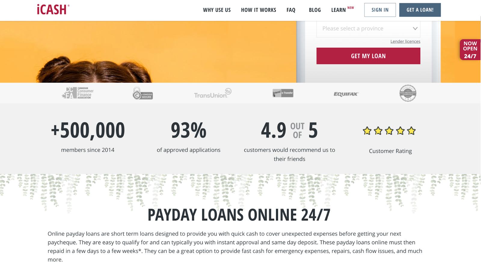
iCASH is a short-term loan provider that allows Canadians to borrow money quickly and without hassle. And, on their online payday loans service page, they have a section where they highlight the fact that 4.9 out of 5 of their customers would recommend the company to a friend. They also mention that 93% of the applications they’ve processed have been approved. And let’s not forget the fact that they’ve had 500,000+ members since 2014.
All of these details come together to convince prospective customers that there are previous clients who have placed their trust in this company and have not been let down. And this can lead to more conversions for iCASH because trust leads to more sales.
You can do the same for your site by showcasing information like the number of customers you have had so far, how you’ve helped your clients, and the overall star rating you’ve received from websites like Google or Yelp.
Make it clear how customers can contact you
If prospective customers have a question or concern, they’ll want to get in touch with your brand. This is why you should make it clear how they can contact you. If it’s difficult to do this, they’re likely to leave your website without making a purchase.
You also want to offer several contact options because people may have different preferences. For example, some customers may prefer to call instead of email and others might want to use a live chat option to talk to a representative in real time.
You should make sure your contact options are visible and clear through your web design. One way to do that is by adding live chat widgets that pop up to let website visitors know that there is a live chat feature on your website. You can find out more about how to add a live chat feature to your website in this guide from Mobile Monkey.
You should also create a “Contact Us” page on your website so customers can clearly see it when they browse through the navigation menu. This will make it easier for them to know where to go when they need your assistance.
Here’s an example of a company that provides several different contact options and makes them very clear through their website design.
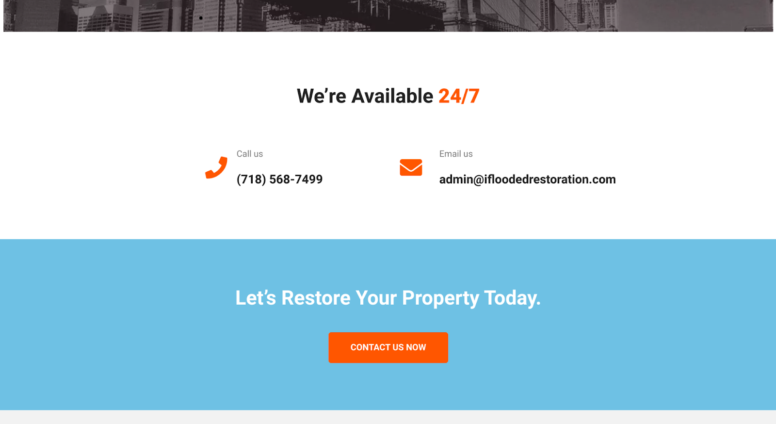
iFlooded Restoration is a company that provides restoration services for houses that have been affected by water damage, fire, or mold.
You never know when a disaster is going to strike your home. That’s why the company has technicians that are on call 24 hours a day, 7 days a week. When you get to their website, you can see that they’ve mentioned this and, if you scroll further down their homepage, you’ll also find a variety of contact options like their phone number and email address.
This makes it incredibly easy for a prospective customer to get in touch, and the numerous options means there’s sure to be a means of communication that will work for everyone. This can earn the trust of new website visitors and lead to a lot more conversions.
When designing your website, you can improve your chance of making plenty of sales by using a similar tactic.
Make sure your site displays properly on any device
If your site doesn’t work well or look attractive for mobile users, it can lead to you losing potential customers. This is why you need to make sure your website has a responsive and aesthetically pleasing design that can work on any device.
It’s also worth noting that Google has implemented mobile-first indexing, which means it will now focus on ranking websites with a mobile version first. While this doesn’t mean desktop-only websites won’t get ranked at all, it does mean Google will prioritize mobile-friendly sites, which could have a negative effect on your search engine rankings.
When it comes to creating a website with a responsive design, you’ll have to consider a lot of details, such as the font size you’ve chosen, how your images display on different screens, and whether your navigation menu is going to work on different devices. If you need any help in this area, JustFreeWPThemes have a wide range of responsive website themes that can take a lot of the guesswork out of this for you.
Summary
There are many factors that can affect your website’s conversion rate and your website design is perhaps one of the most important ones.
To make sure you are doing things right, use images that help humanize your brand, make your call-to-action clear and bold, and ensure you display the reviews and testimonials you’ve received from previous customers.
If you’re looking to give your website an overhaul with this advice in mind, JustFreeWPThemes has a great range of ready-made themes that are ideal for this. You’re sure to find one that’s perfect for your website and that will help you to make more sales.
Author bio & headshot:
Adam Steele is COO and co-founder of Loganix, which is an SEO fulfillment partner for digital marketing agencies and professionals. The company provides the SEO services that businesses need to grow and achieve their goals. If you enjoyed this article, you can find more SEO guides and templates on the Loganix blog.